Munsell Part 2 - Colour
The Munsell Book of Colour & The Brown Coffee Pot
Part 2
Am I welcoming you back? If so “Hi, how great” . Same if this is your first visit “Hello and welcome”.
In early December 2019 I began sharing my first steps with the Munsell Book of Colour. You can see it in Previous Blogs.
And now I’m continuing my Munsell theme and how I’m fitting it into the academic painting methods that I learnt and value highly.
Just a note about these methods. I am putting together a newsletter/ blog that covers the early steps of a painting leading up to this point. Its rather nuts and blots but interesting for those who have gone through it (“Oh no I didn’t understand it like that!”) and perhaps an eyeopener for those who have not encountered these disciplines. At the end of the day – each artist interprets and uses techniques for them self. For me, honing a way of painting that has evolved over much time and through the hands of many great artists is something I can trust and follow and am happy to revere those from whom I have learnt. For others, these unerring principles may seem less useful, they are difficult and take commitment even when they are too difficult.
Part 2 Munsell Book of Colour – Use
I shall be explaining how I use the Munsell Book of Colour with my mainstay and anchor – the Angel Palette as it was when I studied there and how it works for me now.
And I shall be repeating things just to make sure.
First, to begin this work on my painting, I need the Large Local Colours in place and dried – and the photograph below shows the painting at this stage. Not as certain as I would like but it shows you the state of early evolution.
If the dried paint looks dull and has lightened – known as ‘sinking in’ – it is first necessary to apply a very little oil to the surface of the whole painting to re-saturate the colours and give them their full richness and correct values. There are some notes in Glossary recommending how to ‘oil in’.
Once oiled in, I look at the painting starting with the shadows and intensify them if needed, at present I aim to keep the paint in the shadows thin – almost transparent as this adds depth to the even flat colour.
For the lights
For a large area of light, meaning everything that isn’t that specific part ‘in shadow‘ (ie. the cup in shadow or the cup not in shadow – the lights of the cup) I mix up enough paint to use for :
3 levels of value
the darkest, next to and near the shadow
the middle one
the lightest one
The highlights are not taken into account when mixing the lightest one.
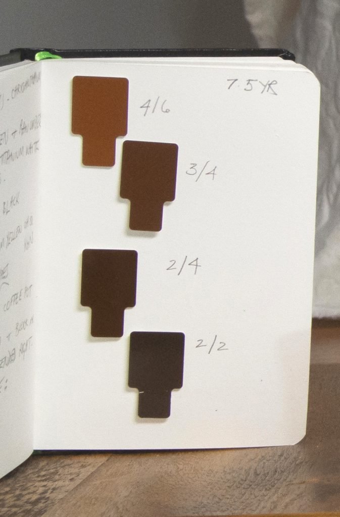
For these three colours I use the Munsell Chips.
How ?
I find the page I need in the book. The right one can be surprising – less chromatic, maybe bluer, redder, more yellow and so on, even positively neutral and not what I think I see. I take the little chips of colour that look like they will match, from their removable pockets and hold them in a particular place on the object I am painting. Remember I am selecting three values for one light area – three different chips.
As I get each one right, I make a small loop of low tack masking tape and stick it to the object. Finding the right ones takes time and its best to keep to one particular page in the Munsell Book to make sure the chosen colours gradually shift as if the object is becoming lighter or darker. For 3 values there are 3 choices – 3 chips.
I’ll make some notes about which paints I use. These are semi-useful. To begin with they list what I use, but as I paint I rarely take time out to add or amend them. However they are useful if I need to find out where I began – knowing from experience that I shall certainly take the same routes from them as needed – its a kind of double check.
Once the three are chosen, it is interesting to see how saturated, how high in chroma, they are – or are not. By looking at them removed from the subject matter these qualities are more evident. The reason for this consideration is:
High chroma colours tend to come forward, lower chroma colours recede. I look for this and work with it.
For the Brown Coffee Pot 2/2 is used for the shadows. For three lights 2/4, 3/4 and 4/6. All come from the 7.5 YR page (YR standing for Yellow Red)
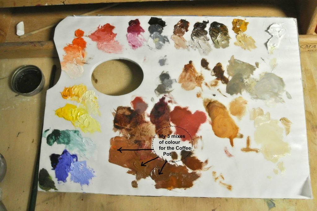
In setting up the colours on the palette, I add whatever necessary extra pigments are needed to supplement the range I always use. And yes, I do use white tear off palettes. They work for me.
On this palette you can see the area that I had mixed and used for the 3 lights. Those along the top are my staple colours. Those running down the left hand side are additions.
It takes time mixing the colours, always trying to get the paint the same as the chip. Also trying to make it the most full of colour, the highest chroma possible for that particular colour. It sounds odd but try it.
To make a colour lighter don’t just go for white.
“Keep the chroma up”
“Keep your chroma under control”
Turning the Form
I will then paint from the shadow to the light using three brushes. Using the colours I have mixed to turn the form – to give it the appearance of being three dimensional. It could well be necessary to modify the colour as progressing but this is done on the palette by moving away from the mixed heap in a little satellite track . Keep the main pile of colour clearly as initially mixed – it is an anchor to return to.
Whatever happens and tempts, don’t rely on blending colours together on the canvas that is not what makes something work – there can be a little bit of this but for the sake of good practice when mixing on the palette think of . . .
getting the values and the chroma !!
There can be several passes made doing this and sometimes fewer, just the first one. Of course fewer means a quicker result. But only if it ‘gets there’ – if it just works without you asking yourself if it does.
I most certainly found this time I was not making constant small changes to the three colours in the way I had become accustomed to. In fact, it was a much more decisive, purposeful and satisfying session. And worked better.
But, I had to do a sketch of the flowers – I couldn’t get them to work in the composition.
And I had to use one of the Neutral Pages in the Munsell Book which are quite beautiful
Now please – this is important
Leave one ‘pass’ to dry before re-working. Give the painting space and yourself a fresh eye on it.
I know now there are many problems. In the composition, can you see how I had to add an extra piece of canvas paper to the right hand side? Right through the Coffee Pot? I guess I shall have to either chop it off again or leave it as unsaleable.
Brown Coffee Pot
40 x 30cm Oil on canvas paper (mounted)
This first attempt to use Munsell has been a real lesson. Even with its problems I love this small painting with that crazy huge begonia and the coffee pot I have known since I was small!
The white flowers looked lovely in the set up but I wonder about the compositional dynamic, whether they are vibrant enough? Do they carry the arch of the composition like a bridge from the pot’s spout to the single begonia flower’s semi circular shape ? The carafe doesn’t really lean as it seems to here.
For my next painting I am making drawings, small colour studies, squaring up graphite drawings to see how they work larger. I even may have photo copies made at different ratios to see how it feels before committing to a painting.
The coffee pot is not a finished subject. There will be another, the winter version will have to rely on faux poppies – which are looking better.
Even with all these doubts, let me return to the beginning. I am so grateful for the training I have been fortunate enough to receive from a number of artists. I hold the guardianship of it with great pride and responsibility to try and pass some of it on, melded with my working experiences. With the photos I hope all is clear? Please do get in touch with any questions! Or thoughts.
And finally, here is my most recent drawing – its tiny, monochrome. Just wait until you see the wonderful colours in the apples ! Now let me just find the right Munsell page . . .


